UX - Competition microsite
A competition microsite housing the landing page and entry form.

The Challenge
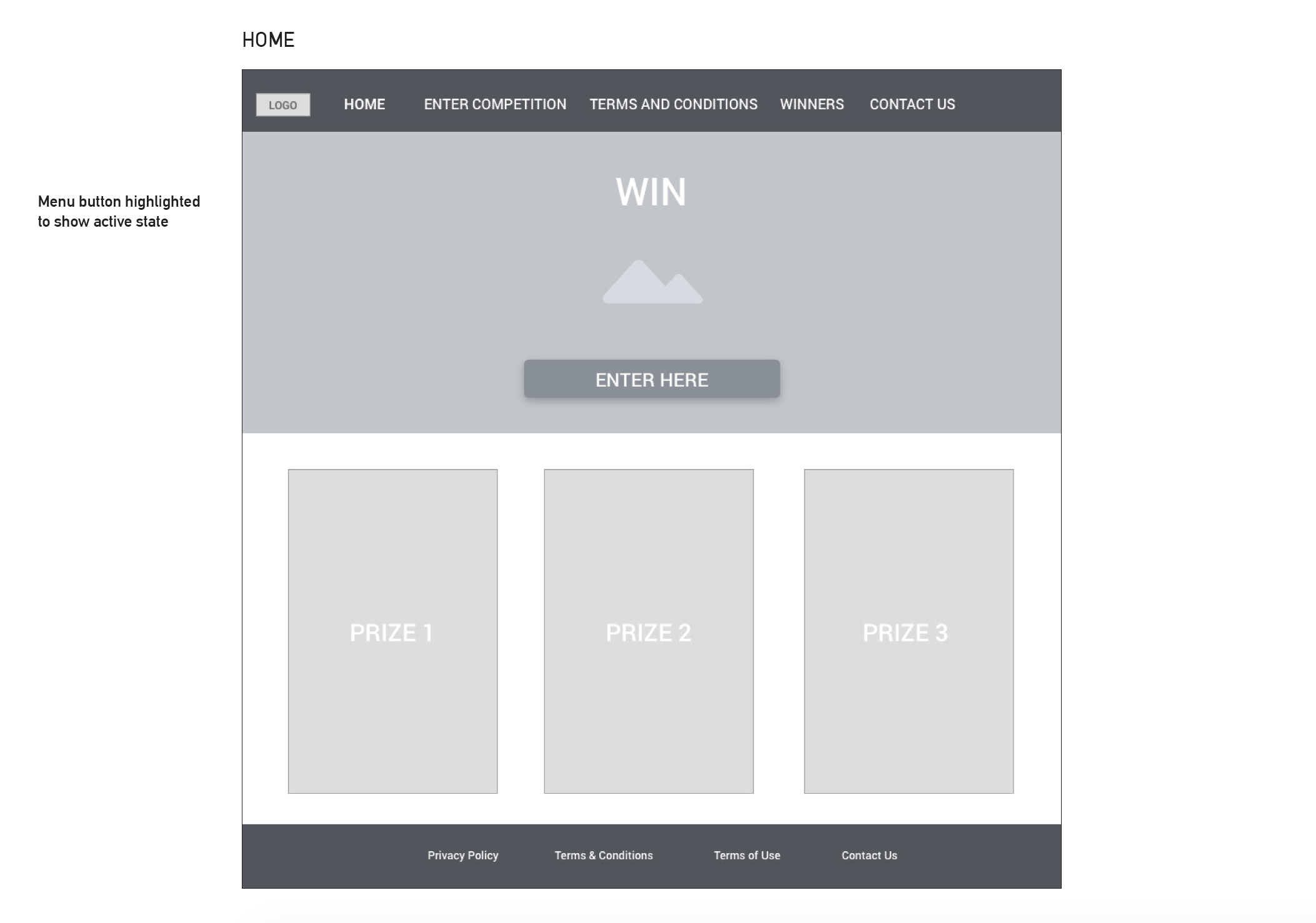
The challenge was to create a responsive site for a garage door competition entry form with out overwhelming the user.

The Problem
How may we create an entry form that was easy to use on either desktop or mobile?

The Approach
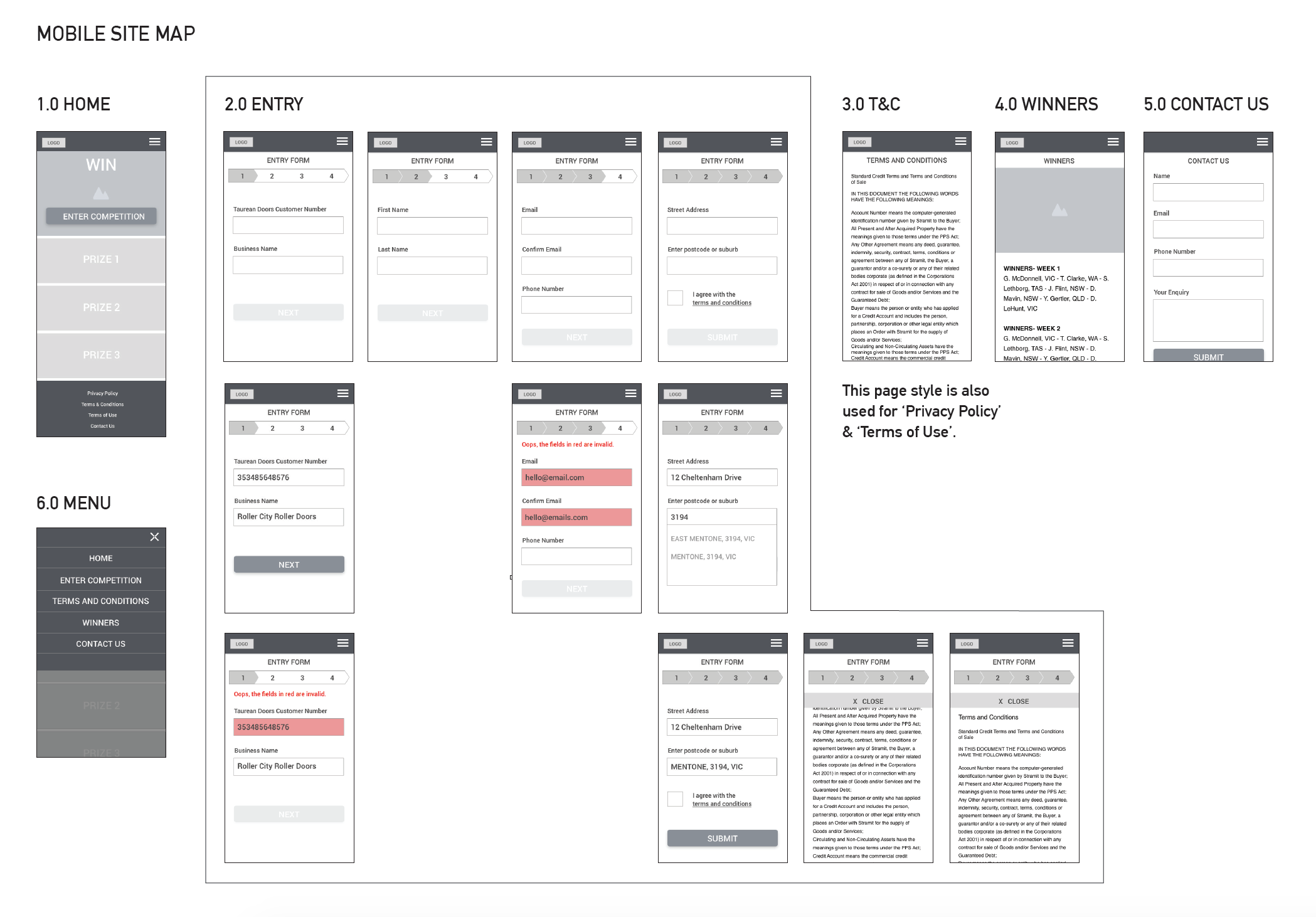
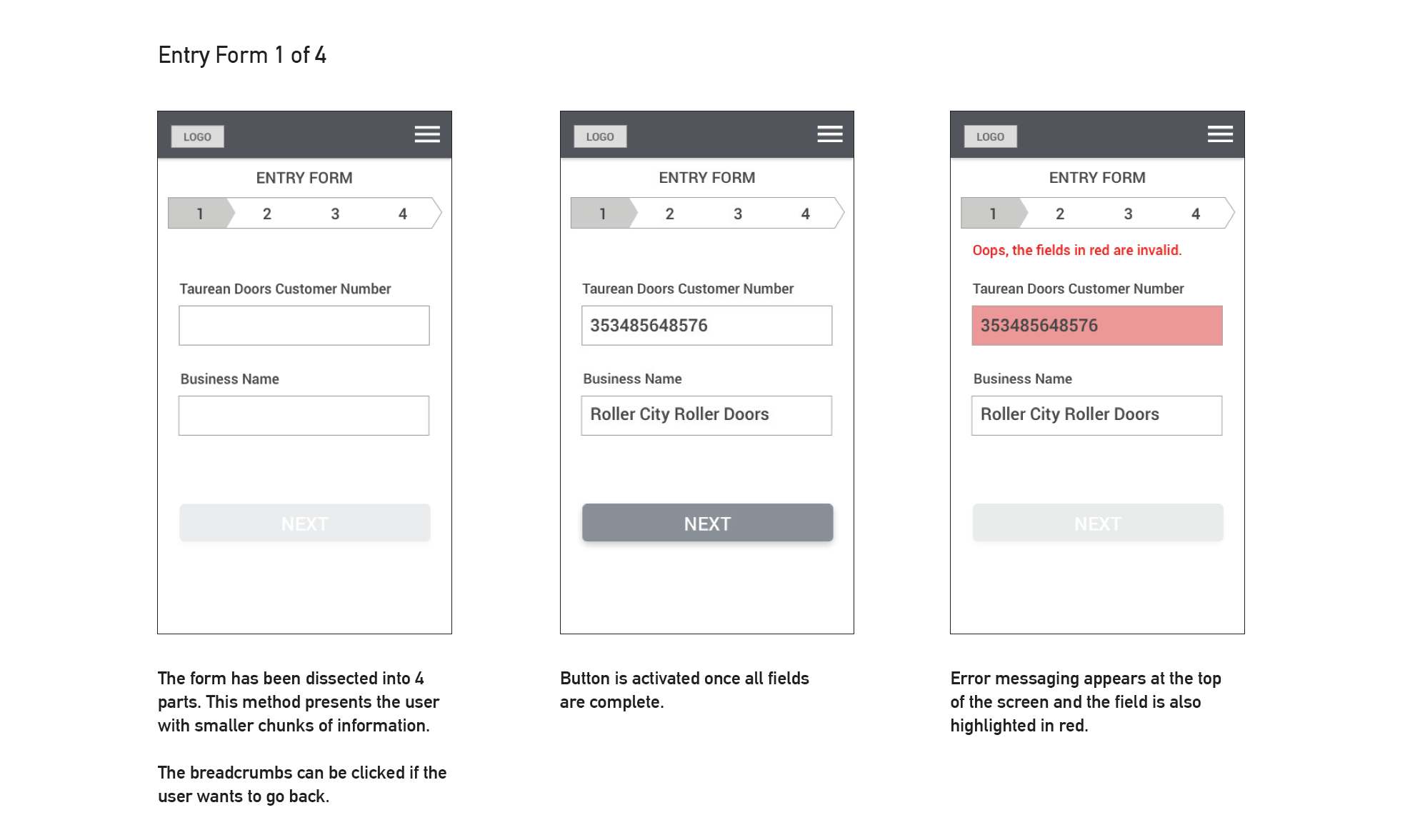
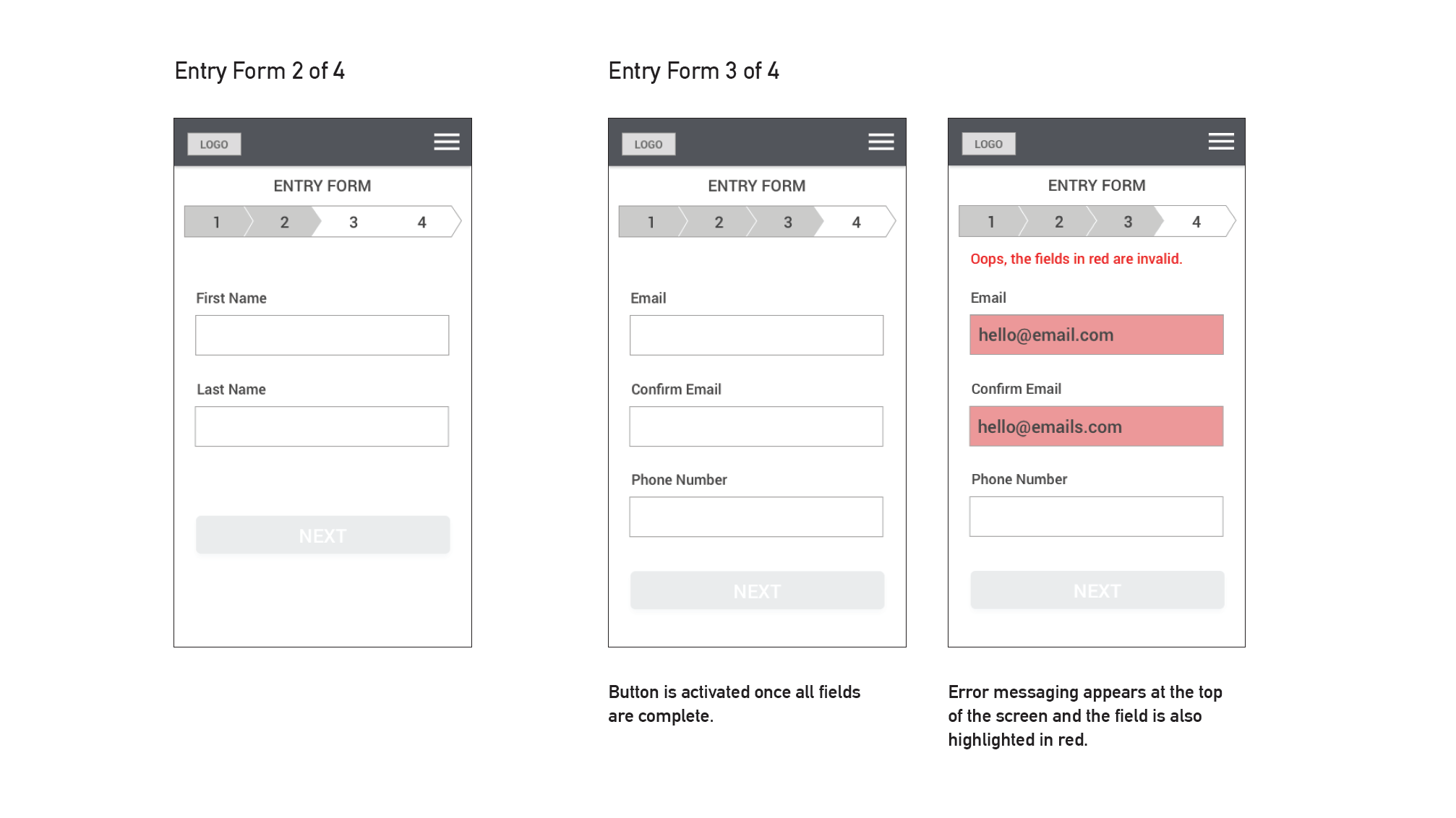
A good starting point was following common patterns that are best practice input field design. Then screens were sketched based on mobile as the there would be a high volume of mobile users. The wireframes were then iterated and then a screen flow was designed. Splitting up the input fields into four steps also made the task simpler. The address input was created using a look up service which meant the user only had to enter a street and postcode or suburb. By chunking information it more smaller parts it becomes less overwhelming.
Methodologies
- User Flows
- Competitor Analysis
- Wireframes
- Prototype
- Usability Testing
The Result
There was a high volume of entries that originated from mobile devices. This was a strong indication that there was ease of use of the entrants as user are less likely to complete a longer form on a mobile device.